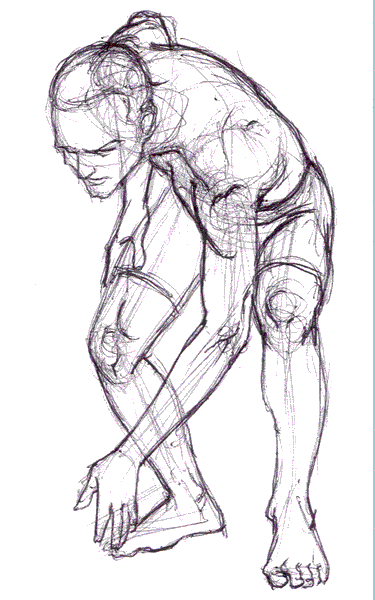
Sketch: A few minutes.
This is a test to see if I screwed up my ability to post blogs now that I've completely redone my portfolio website.
I wanted to integrate my blog into the website to "brand" it to my ArtwithByte signature. My old portfolio site remained unchanged for some years. It was ripe for refreshing. Plus it was pretty ugly.....when held in comparison to the new look.
The new design came about from a desire to make the site more user-friendly but still attractive and fun to browse. I patterned it after media company websites which usually have something moving in every corner of the screen. The basic structure has not changed from the previous site.
The portfolios are still embedded in the flash player. But instead of having to drill down in order to get to a particular portfolio, a concise module for each one is readily available on the front page. Each module can be opened up to view higher resolution images and animation......eventually.
I like how they all move in their own way. I want to expand on that with the individual portfolio webpages, which are under construction at the moment. The front page layout will not change, nor will the way they are viewed. I am working on making each of the modules a standalone player that will call images and animation from an .xml document. This will make the update process much less difficult. The portfolio webpages will work the same way, only bigger and better(hopefully). Check out simpleviewer and slideshowpro for examples of what I'm aiming for. I could probably just go with one of those. We'll see.
The new website was also my first attempt at coding in CSS (cascading style sheets). I've got to say I frickin' love CSS. It's a cakewalk compared to that HTML crapola. I took the original weblog code and just tried to add my own code to it without breaking it too badly. I'm thinking It's going to work (crossing my fingers as I type this).


0 Comments:
Post a Comment
<< Home